Picture this: You spot a bright red can on the shelf. It grabs your attention right away. That’s Coca-Cola’s secret weapon. Their red color stirs up excitement and energy, making you reach for them without a second thought. Why do brands pick these hues so carefully? Color psychology explains it all. It studies how colors shape our feelings and choices.
This field mixes science and art. Colors hit us deep, affecting moods and actions in subtle ways. In branding and marketing, they build trust, spark desire, or push quick buys. Marketers use them to connect with customers on a gut level. This article breaks it down step by step. You’ll learn the basics of color psychology, how hues trigger emotions, strategies for branding, and tips for campaigns. By the end, you’ll have tools to pick colors that boost your brand’s power.
The Fundamentals of Color Psychology
Colors have shaped human views for ages. Think of cave paintings from long ago, where red ochre stood out for its bold presence. Today, experts in fields like environmental psychology dig into this. They show how surroundings, including colors, change our behavior. Understanding these basics helps marketers craft stronger messages.
What Is Color Psychology?
Color psychology looks at how hues affect what we think and do. It draws from studies on the mind and senses. Colors can calm you or fire you up without words. For example, a blue room might make you feel safe.
Research shows these effects run deep in our brains. They link to survival instincts from way back. Marketers can test this in their work. Try surveys in your niche to see what colors draw people in. What hue makes your audience feel most at home? Start small and watch the responses.
The Science Behind Color Perceptions
Our eyes catch light waves that the brain turns into colors. This happens fast in the visual cortex. Then, it links to emotion spots like the amygdala. Biology plays a big part-red jumps out as a warning signal.
Culture adds layers, too. In one place, yellow means joy; in another, caution. Tools like eye-tracking help measure this. They show where eyes linger on a page. Use them to test how your ad’s colors hold focus. Pick hues that match your crowd’s reactions for better results.
Common Color Associations Across Cultures
Some colors mean the same thing almost everywhere. Red often signals stop or love. It grabs eyes quickly. Green hints at nature and calm in most spots.
But differences pop up. White stands for clean and new in the West. In parts of Asia, it ties to loss and sadness. McDonald’s yellow arches bring a sense of fun and welcome worldwide. For global plans, research local views. Check what colors fit in each market. This avoids mix-ups and builds stronger ties.
How Colors Evoke Emotions and Influence Decisions
Colors don’t just look pretty. They stir feelings that guide what we buy. A study from the Journal of Consumer Research found that the right hues can lift sales by up to 20%. In marketing, this means smarter choices lead to more clicks and carts.
Think of it like a hidden language. Your brand’s color speaks before you do. Now, let’s see how key shades pull at heartstrings.
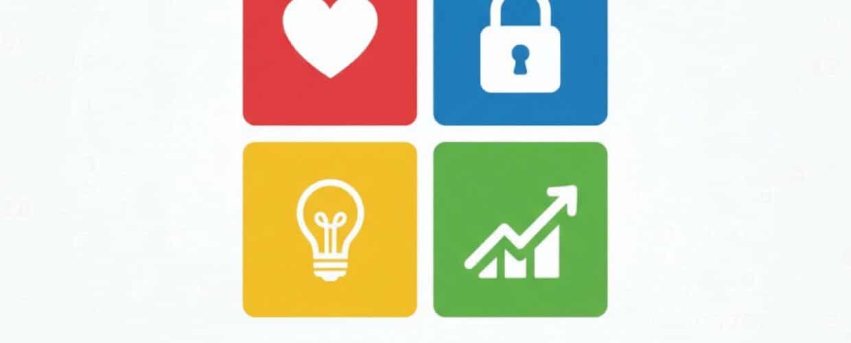
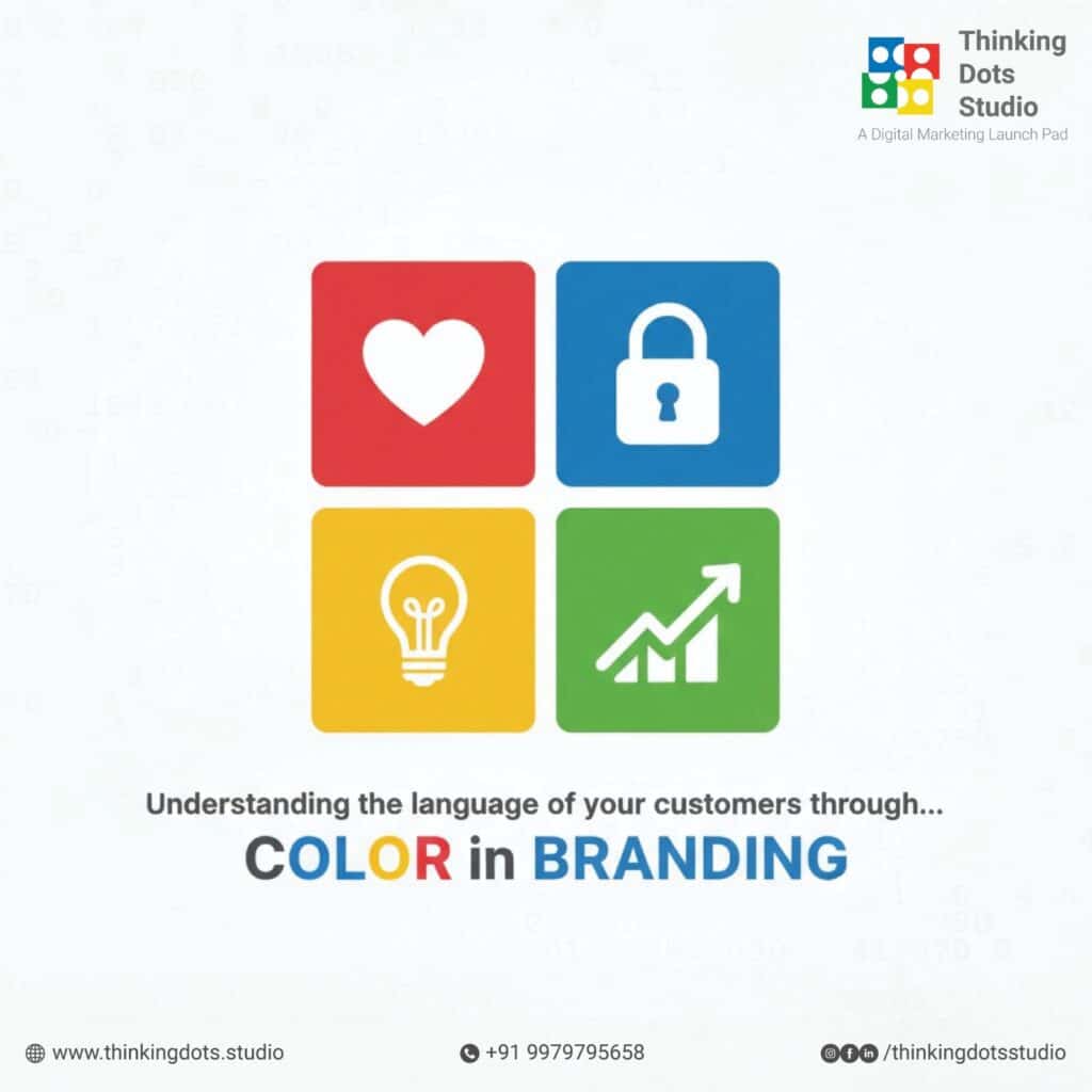
Primary Emotions Triggered by Key Colors
Blue builds trust and peace. Banks like Chase use it to say “reliable.” You feel steady when handing over cash.
Red amps up energy and rush. Netflix’s red button screams “play now.” It pushes you to act fast.
Green sparks thoughts of health and fresh starts. Starbucks greens up its logo for that cozy, growing vibe. Match your shade to your brand’s feel. Ask: Does this color fit what you want customers to sense?
- Blue: Calm, trust-great for tech or finance.
- Red: Excite, urge-ideal for food or sales.
- Green: Balance, eco-suits, wellness brands.
- Yellow: Cheer, quick-works for fun products.
- Purple: Fancy, creative-lifts luxury lines.
Test these in your next design.
The Role of Color in Subconscious Decision-Making
Colors slip under the radar. They nudge you toward a choice without you knowing. In stores, warm tones like orange make you shop longer. A test showed orange buttons on sites raise clicks by 32%.
Amazon’s orange “add to cart” stands out against white. It says “go” without yelling. Contrast matters here. Pair bold colors with neutrals for clear calls to action. Watch how small tweaks change buy rates.
Measuring Emotional Impact in Marketing
Track feelings with simple polls. Ask users how a color makes them feel. Tools like Google Analytics show hard numbers, like time on page.
For deeper looks, run A/B tests. Swap colors in emails and see open rates. In design, follow user paths to spot drop-offs. Aim for setups that keep folks engaged. This way, colors work harder for your goals.
Color Strategies in Branding: Building Identity and Recognition
Brands stick in minds through colors. Think of that golden M-it means fries and smiles. Good color picks create a lasting mark. They help you stand out in a full market.
Long-term, colors tie your story together. Let’s build on that base.
Choosing Colors That Align with Brand Personality
Match hues to your brand’s core. Luxury calls for deep black, like Chanel’s sleek bags. It whispers high-end without noise.
Start with your values. Energetic? Go bold red. Trusty? Stick to blue. Tools like Adobe Color let you mix palettes easily. Build a set of 4-6 shades. Test them on mockups. Does it feel right for your voice?
Iconic Brand Color Case Studies
Tiffany & Co. nails it with robin’s egg blue. That soft shade screams rare and special. It turns boxes into treasures.
UPS sticks to brown for solid trust. Their trucks say “on time” every mile. From these, learn to own your hue. Update slowly if needed, but keep the heart. Shift shades, not the soul, to stay fresh.
- Tiffany: Blue for elite appeal-sales are tied to that gift box, wow.
- UPS: Brown for dependability-built loyalty over decades.
- Coca-Cola: Red for joy-unchanged since 1886, pure recall.
Copy their focus on fit. dependability-built
Ensuring Color Consistency Across Touchpoints
Colors shift from screen to paper. Digital glows; print stays flat. Match them with guides like Pantone codes.
Think access too. WCAG rules help color-blind folks see clearly. Use enough contrast for text.
Checklist for steady use:
- Lock core colors in your style guide.
- Test on phones, sites, and packs.
- Train teams to stick to it.
- Check yearly for drifts.
This keeps your brand sharp everywhere.
Applying Color Psychology in Marketing Campaigns
Now, take those ideas to the field. Colors in ads can turn heads and fill wallets. A smart pick might hike engagement by 15%, per marketing stats.
From posts to emails, hues set the tone. Let’s apply it right.
Color Choices for Different Marketing Channels
Social media loves pops of color. Instagram’s gradient logo bursts with life. It pulls the scrolls to a stop.
Emails need softer tones. Muted blues open trust without overwhelming. Test per spot-what works on Twitter might flop in print.
- Social: Bright, fun-red for likes.
- Email: Calm, pro-green for opens.
- Ads: Bold contrast-yellow grabs fast.
- Video: Warm flows-orange for energy.
Adapt to each space.
Leveraging Color for Seasonal and Event-Based Promotions
Holidays scream red and green. Target wraps sales in them for that festive pull. It ties to joy and gifts.
For summer, blues and yellows cool and cheer. Build stories around the season. Red sales banners say “now or miss out.”
Strategies:
- Pick theme colors early.
- Tied to emotions-like pink for love events.
- Track lift in views and buys.
This boosts timely wins.
Ethical Considerations and Avoiding Color Pitfalls
Colors can trip you up. Pink for girls’ toys? Old habit that boxes people in. Go neutral to welcome all.
Access matters. Skip low-contrast pairs that hide text. Watch feedback for blind spots.
Tips for fair picks:
- Research diverse groups.
- Avoid stereotypes.
- Test with real users.
- Adjust based on input.
Stay true and kind.
Conclusion: Harnessing Color Psychology for Marketing Success
Colors shape how folks see and act on your brand. From blue’s trust to red’s rush, they trigger emotions that drive choices. In branding, they build icons like Tiffany’s blue. For campaigns, they fit channels and seasons to spike results.
Key points stick: Know basics, match to feelings, stay consistent, and test ethics. Audit your colors now. Try new palettes in tools. Track how they change clicks and sales.
Apply this, and you’ll edge out rivals. Your brand will connect deeper, turn more heads, and grow steadily. Start tweaking today-what color will you choose?