Introduction
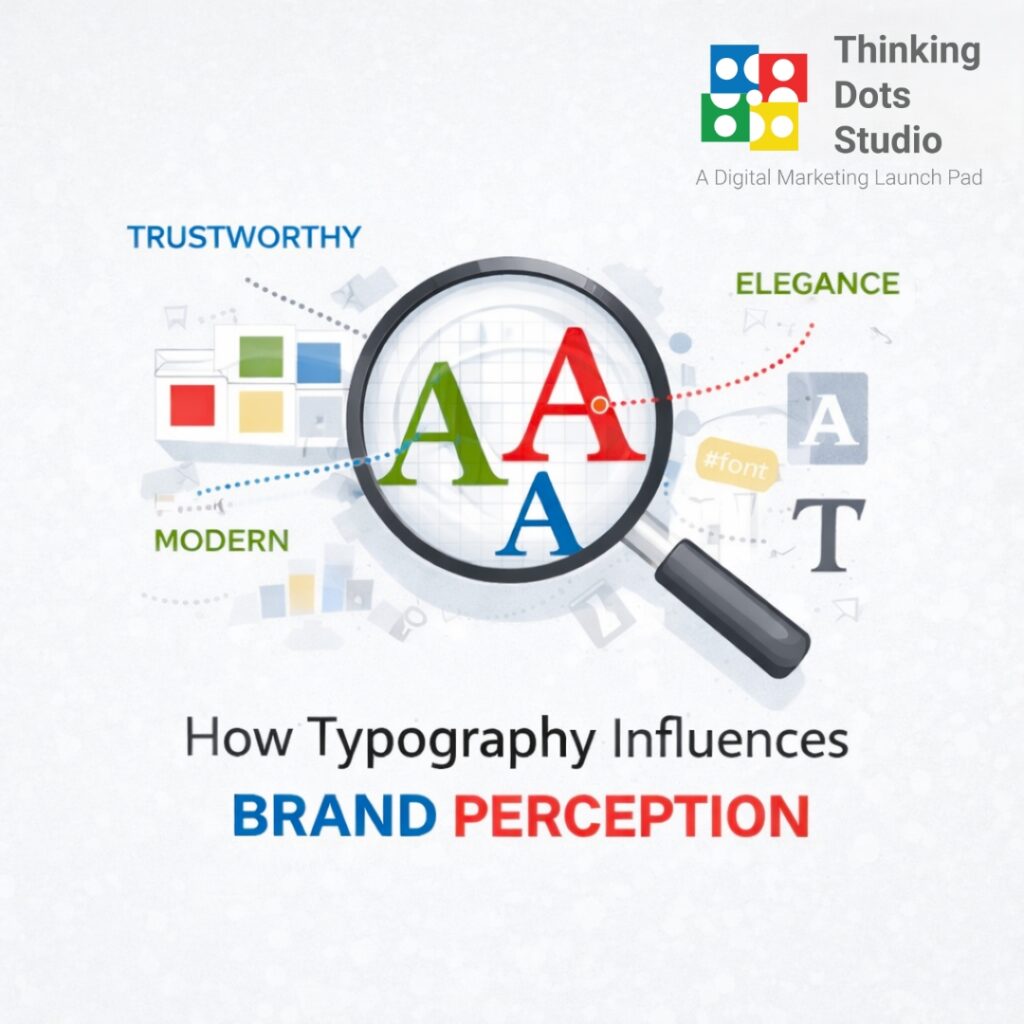
When you think about branding, the first things that come to mind are usually logos, colors, and imagery. But there’s another element that plays a powerful role in shaping how people see a brand’s typography. Typography is more than just choosing a font. It’s the art of arranging type to make written language not only legible but also expressive. The way letters are designed and presented can make a brand appear modern, traditional, playful, luxurious, or trustworthy. In fact, typography is often the silent storyteller behind every brand message.Why Typography Matters in Branding
- First Impressions Count People judge brands in seconds, and typography plays a big part in that judgment. A clean, bold typeface might communicate confidence, while a handwritten style might feel personal and approachable.
- Shapes Brand Personality Fonts have character. Serif fonts often feel traditional and reliable, while sans-serif fonts convey modernity and simplicity. Choosing the right type helps align visuals with brand values.
- Affects Readability and Engagement Good typography makes content easy to read. Poorly chosen fonts, on the other hand, can create confusion or frustration, damaging the customer experience.
- Drives Emotional Response Typography influences how people feel when they interact with a brand. For example, luxury brands often use elegant typefaces to evoke sophistication.
Types of Typography and Their Meanings
1. Serif Fonts
- Recognizable by the small strokes (“serifs”) at the end of letters.
- Convey tradition, trust, authority, and elegance.
- Common in industries like law, publishing, and luxury. Examples: Times New Roman, Georgia, and Garamond.
2. Sans-Serif Fonts
- Clean, simple fonts without decorative strokes.
- Represent modernity, clarity, and minimalism.
- Popular in tech, startups, and healthcare. Examples: Helvetica, Arial, Futura.
3. Script Fonts
- Designed to look handwritten or cursive.
- Suggest creativity, elegance, or personalization.
- Used in fashion, beauty, and hospitality brands. Examples: Brush Script, Pacifico, Great Vibes.
4. Display Fonts
- Bold and decorative, often used for headlines.
- Perfect for brands that want to stand out or be playful.
- Common in entertainment, food, and creative industries. Examples: Impact, Lobster, Bebas Neue.
Famous Examples of Typography in Branding
- Coca-Cola-The flowing, script-style font feels friendly and timeless.
- Google-Its clean sans-serif font communicates simplicity and approachability.
- The New York Times-The traditional serif font reflects authority and heritage.
- Disney-The playful, custom typography captures imagination and magic.
- Chanel – Sleek sans-serif letters emphasize elegance and luxury.
How Typography Shapes Perception
- Luxury Brands → Often use serif or custom-designed, elegant fonts to signal exclusivity.
- Tech Brands → Usually opt for sans-serif fonts to highlight innovation and simplicity.
- Youth-Oriented Brands → May use bold, playful fonts that feel fun and expressive.
- Professional Services → Rely on classic serif fonts to build credibility and trust.
Tips for Choosing the Right Typography for Your Brand
- Know Your Brand Personality-Is your brand bold and fun or calm and professional? Choose fonts that reflect this.
- Prioritize Readability-Fonts should look good across digital and print mediums.
- Be Consistent-Use the same font family across all materials (website, ads, packaging).
- Limit Font Choices – Too many fonts create chaos. Stick to two or three complementary typefaces.
- Test Across Platforms-Make sure your typography looks good on mobile, desktop, and physical packaging.